CSS Positioning
Demystify this confusing yet crucial aspect of beginner’s CSS.

CSS positioning is the first major roadblock on your web development highway.
The principles of HTML are pretty straightforward. CSS is also easy to get your head around. But once you understand the difference between margins and padding, you are confronted with the rather confusing subject of positioning elements.
CSS positioning is confusing because:
- the behavior depends on the position of the parent elements
- some position values take the element out of the document flow
- values like top and left have different meanings depending on the position of the element
I hope this article can clarify some of the confusing parts.
Static: The Default Position
The following CSS doesn’t change a single thing.
.element {
   position: static;
}
Statically positioned elements have their position determined by the parent element.
These elements will appear in the upper left corner of their parent element unless you change some alignment settings.
.element {
   position: static
}
<div class="parent">
   <div class=”element”></div>
   <p>(Containing Element)</p>
</div>
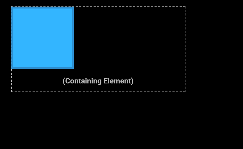
Statically positioned elements take up a static amount of space in the document.
If you add a second statically positioned element, it will be in a different position than the first element. We can say that the first element takes up space, so it pushed the second object to a new position.
.element-1 {
   position: static;
}

.element-2 {
   position: static;
}
<div class="parent">
   <div class=”element-1”></div>
   <div class=”element-2”></div>
   <p>(Containing Element)</p>
</div>
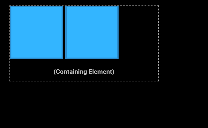
Without making changes to the position property, you are extremely limited in how to position elements. You are stuck with options like change the position implicitly, such as float, alignment, and padding. The remaining position options help to give you finer control.
Relative: Move from Where you Were
Relative positioning will change the position of the element, but it will not affect the static amount of space that element takes up in document.
.element {
   position: relative;
   top: 20px;
   left: 70px;
}
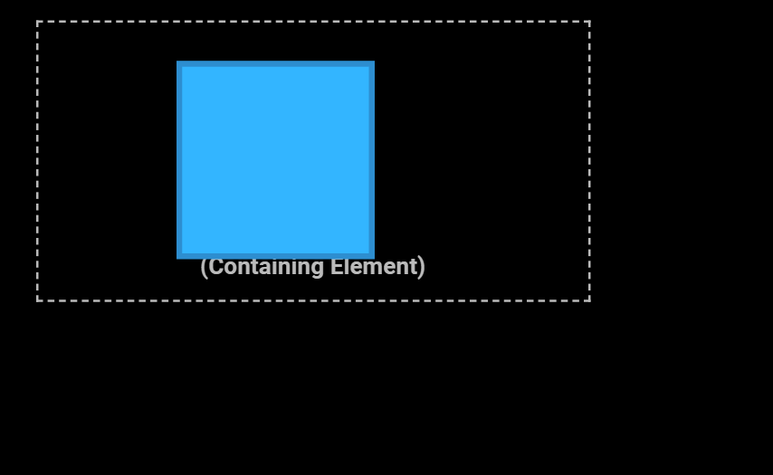
This is the first time we have seen the properties top and left. These, along with bottom and right, are the way you actually adjust the position. Their behavior will change depending on the position mode, so it’s not possible to generalize how they will function. But for relative positioning, you can think of them as meaning “how far away from this direction the element should move."
Notice how the parent’s size has not changed. The size of the parent element is determined by its children: the element being positioned and the text. Despite being able to move the child element in an arbitrary direction, the parent is still sized as if the child hadn't moved.
You can also adjust the position by using the bottom and right properties.
.element {
   position: relative;
   bottom: 20px;
   right: 20px;
}
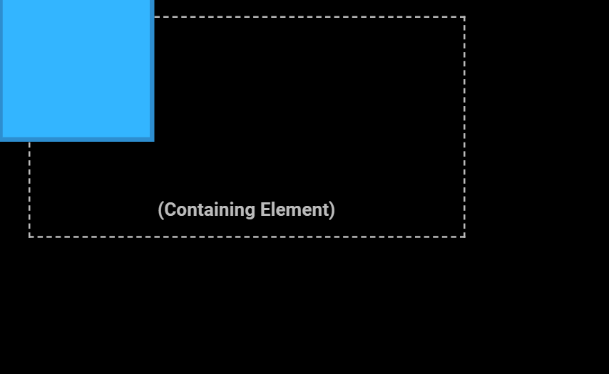
It might seem a little unnatural that a positive value on the bottom and right properties moves the position upwards and to the left. But the value is determines how many pixels away from that element’s original edge (the bottom edge, the right edge, etc) the new position should be.
So…
.element {
   right: 50px;
}
means that it should move 50px away from its former right edge, which has the effect of making it go left.
The value can also be negative.
.element {
   right: -10px;
}
This has the effect of moving the right edge further right.
Actually these two rules:
.element {
   right: -10px;
}
.element {
   left: 10px;
}
have the same result.
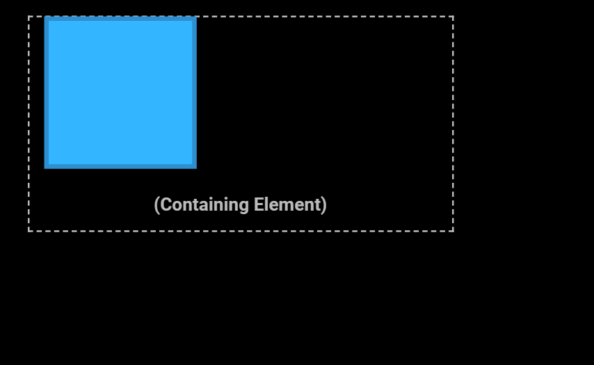
You’ve probably noticed that it is possible to move an object outside the bounds of its parent.
.element {
   position: relative;
   top: -60px;
   left: -25px;
}
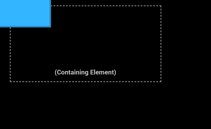
This might be the effect you want, but you also might want to prevent the child from messing with surrounding elements. To clip the children to the parent's bounds, set the overflow property on the parent.
.parent {
   overflow: hidden;
}

.element {
   position: relative;
   top: -60px;
   left: -25px;
}
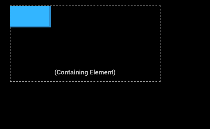
There are a few other overflow values out there if you want a slightly different effect.
Absolute: Lock to Nearest Containing Block
With absolute position, we see how just setting a position value can cause a change in the way the element renders.
.element {
   position: absolute;
}
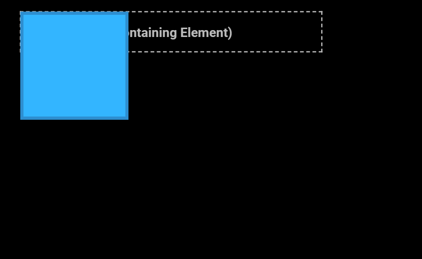
The parent object has shrunk as if the element never even existed. This is because absolute positioning removes elements from the document flow. In the relative example, the parent stayed the size it would have been had the element remained in the document flow. Now it is as if the element was not even a child of the parent.
But the connection is not completely severed. The element is still positioned relative to the upper left corner of the parent.
That changes as soon as you set directional position values.
.element {
   position: absolute;
   top: 0;
   left: 0;
}
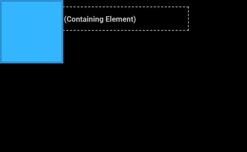
Now the element is positioned relative to the document.
Setting the bottom and right values cause a different effect.
.element {
   position: absolute;
   bottom: 0;
   right: 0;
}

Slightly More Complex Truth #1: Nearest Containing Block
Ok, it's not actually positioned relative to the viewport. If it were, when we scroll this wouldn't happen.

What absolute positioning is doing is setting the position relative to the nearest containing block. When none of the element's ancestors have a different position value, the nearest containing block is something called the initial containing block. It is a block set by the size of the viewport, but it exists on the document. That's why the element seems to be in the bottom right of the window, but scrolls up with the document.
Slightly More Complex Truth #2: Nearest Containing Block can be a Parent Element
The more common use case for an absolutely positioned element is not to get the viewport-but-not-viewport effect above, but rather to position relative to a parent element. But the element will only position relative to its closest positioned ancestor.
Closest positioned ancestor? What does that mean?
When we think about HTML as a tree, we can think of objects as being members of a family.
<main>
   <div class="parent">
      <div class="element"></div>
      <p>(Containing Element)</p>
   </div>
</main>
main is the parent of the parent div. The parent div is the parent of the element div and the paragraph. The element div and the paragraph are siblings.
So we can say that any object which is a parent, or a parent of a parent, or a parent of a parent of a parent, is an “ancestor”. This means that from the element div’s point of view, both the parent div and the main element are ancestors.
Ok, “closest positioned ancestor”—if an element is positioned, we just mean that its position property is set to something beside static. This makes the parent div into the nearest containing block—not the initial containing block set by the viewport size.
.parent {
   position: relative;
}
We’ve seen earlier that this code by itself makes absolutely no difference to the position of the element itself. But when a child (or a “descendant”) of a positioned element has an absolute position, that descendant will position itself relative to that element. (Yes, "absolute" positions something "relative" to the parent. Remember, "relative" positions relative to itself.)
Let's go back to the element being the only thing on the page with a set position.
.element {
   position: absolute;
   bottom: 0;
   right: 0;
}
The element is positioned in the bottom right of the initial containing block, because there is no directly positioned ancestor.
But now let’s add a position to the container.
.container {
  position: relative;
}

.element {
  position: absolute;
  bottom: 0;
  right: 0;
}
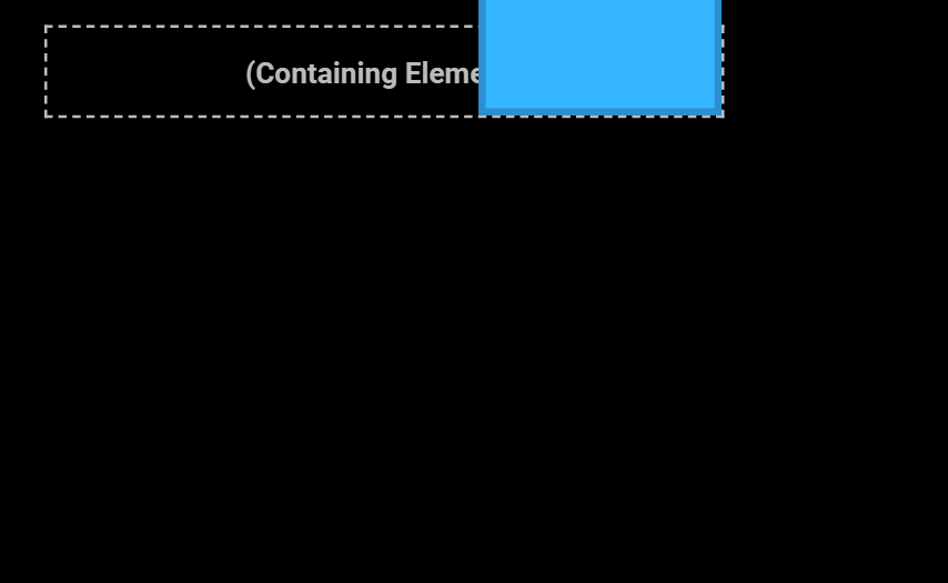
All of a sudden, the element is positioned relative to the container instead.
This is where absolute positioning gets really powerful. But that power comes with the potential of confusion. Because if you’re troubleshooting an element that isn’t where you want it to be, you need to look at each ancestor to check whether it is positioned, because that will affect the position of the child.
Fixed: to the Viewport
A fixed position is also immediately taken out of the document flow. In that way, it's just like an absolute position.
The difference is that fixed elements really don’t care what their parent’s position is. The same example we saw before
.parent {
   position: relative
}

.element {
   position: fixed;
   bottom: 0;
   right: 0;
}
with a fixed element will attach itself to the bottom right of the viewport. The absolutely positioned element did this when the parent's position was static. But even though its parent is now positioned as relative, the fixed element sticks to the viewport.
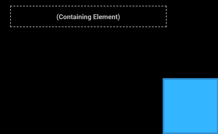
More importantly, this element is actually stuck to the viewport. That's why it stays still as you scroll the document.
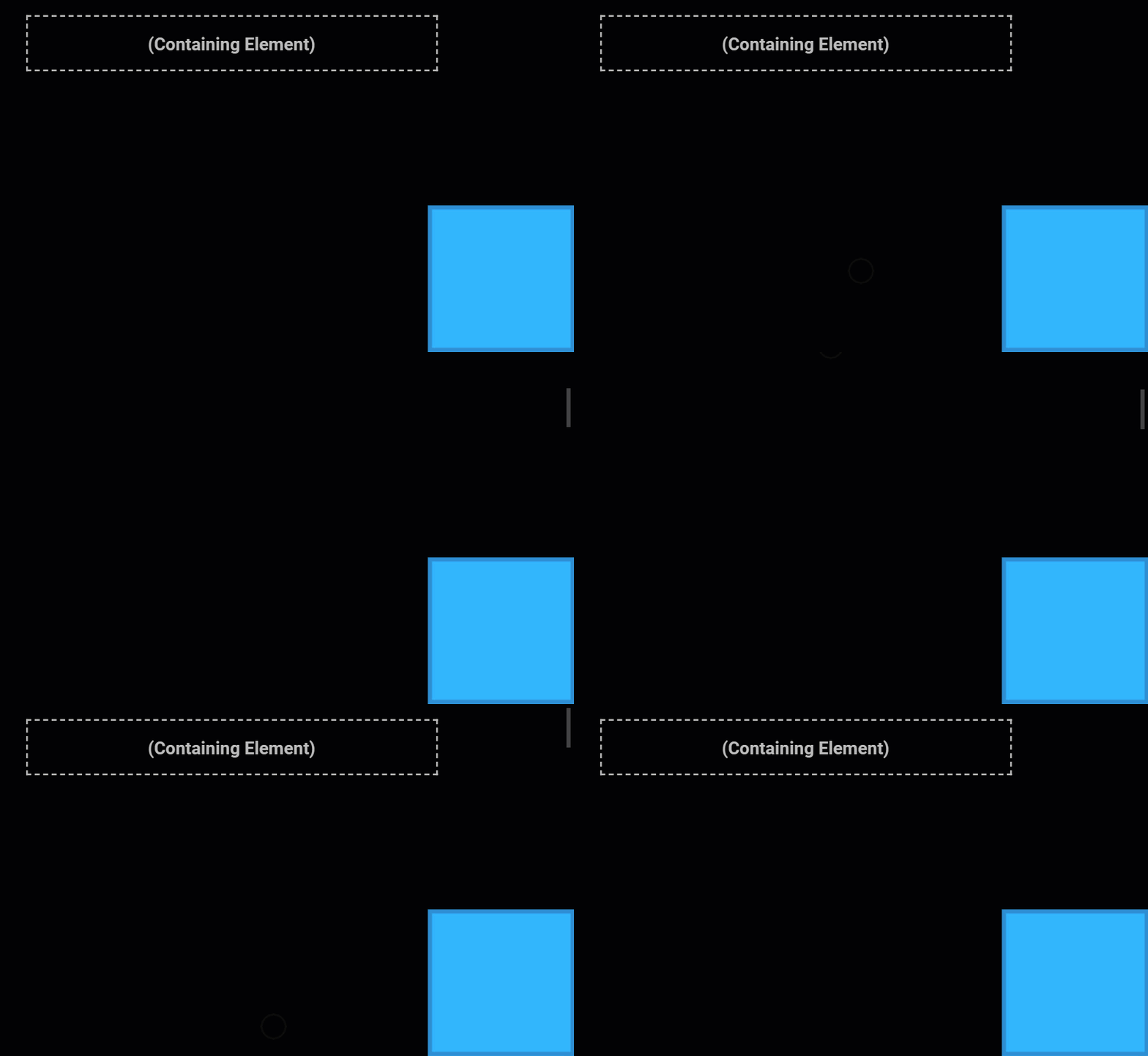
So if what you actually want is an element positioned relative to the viewport, you should use fixed instead. That way you don’t need to worry about the position of the object’s parent.
But at this point, you should ask yourself—why would you have a child object that has absolutely nothing to do with its parent?
<main>
   <div class="parent">
      <div class="element"></div>
      <p>(Containing Element)</p>
   </div>
</main>
It would make more sense to have this fixed element be on the root of the HTML.
<div class="element"></div>
<main>
   <div class="parent">
      <p>(Containing Element)</p>
   </div>
</main>
Still, anything is possible with CSS and that's the power of the different position modes.
~
Cheat sheet
Static
- Default position for all elements
- Element is inside document flow
- Element is positioned in upper-left of its parent
- Directional position properties (top: 15px) have no effect
Relative
- Element is inside document flow
- Directional position properties change position relative to its original position
Absolute
- Element is not in document flow
- Element is positioned relative to closest positioned ancestor
- If there is no closest positioned ancestor, positioned relative to initial containing block
- The element will move as you scroll the page
Fixed
- Element is not in document flow
- Element is positioned relative to viewport
- The element will not move as you scroll the page

